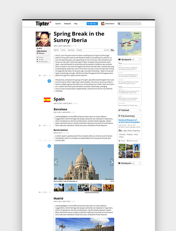
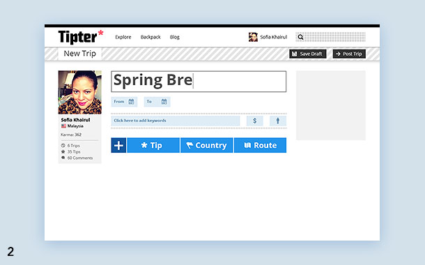
Tipter.com
University of California Humanities Research Institute (UCHRI) needed a visual identity for a new initiative called Horizons of the Humanities that explores ideas around technology, social media and how it affects humanity. No one else has brought these ideas together in the same way and they wanted a dynamic, varied else has brought these ideas together system they could use for materials over the course of their 3-year Mellon grant.
Creating an H out of “data points”, the dots from the logo can be used to create a multitude of illustrations in dynamic colors for different aspects of the initiative. Hexagon shapes can be used overlapping, inside recognizable icons or as a vessel for photography.

Challenge
First impressions are everything.
We’ll help you develop a unique an and consistent visual identity and voice that aligns with your company objectives and captures an audience right from the start.
Proto, a jean manufacturer and distributer, askedus to redesign its brand identity. The concept they were looking for was to enhance the vintage feel of their shops while maintaining a contemporary overall feel.
The new identity is based on a customized hand drawn font with iconography that can be used either on display or also as patterns for garment production.


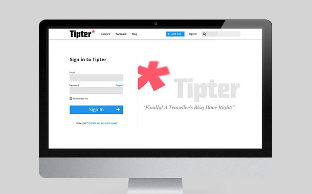
Solution
First impressions are everything.
We’ll help you develop a unique and consistent visual identity and voice that aligns with your company objectives and captures an audience right from the start.
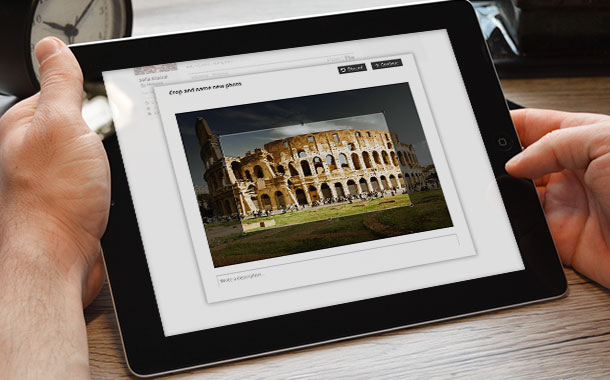
“We want Artlab to do all of your UX/UI design. We have not come to this conclusion casually. we have searched and searched and we have only found these guys, who we all agree can make our products WOW!”
— David Stone, CEO at Tipter.com

Deployment
The use of mobile devices to surf the web is growing at an astronomical pace, but unfortunately much of the web isn’t optimized for those mobile devices. Mobile devices are often constrained by display size and require a different approach to how content is laid out on the screen.
A multitude of different screen sizes exist across phones, “phablets”, tablets, desktops, game consoles, TVs, and even wearables. Screen sizes are always changing, so it’s important that your site can adapt to any screen size, today or in the future.
